Monday 27 January 2014
Final Video Sequence / Sting / Trailer
Oppression Film festival Sting from James Kilby on Vimeo.
Watch in HD! Full length video to be shown as a trailer / sting at independent cinemas and on film4 plus at the festival before each film plays.


Sunday 26 January 2014
Ident / Video Ad Poster
Looped video to be displayed as short web advertising and on the London underground digital ad spaces.
Watch in 720p HD!


London takes digital advertising underground
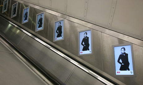
The London underground is a perfect place to advertise the video ad/poster for the festival with its repetitive advertising.
Reminds me of Children of men...

Conclusion
In this project I have referenced a wide
range of influences that encompass the themes and tones of the films I have
chosen that represent the subject of ‘Oppression’ in British dystopia.
For the visual identity I wanted something
that was strikingly bold and simple which would symbolize the idea of
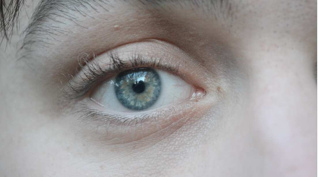
oppression. The first symbol that came to mind was ‘the eye’ I was struggling
at first because I thought maybe it was maybe too obvious. However after
re-watching my chosen films I realized it was obvious choice for a reason as it
is a recurrent symbol for each of the films especially ‘1984’ and ‘A Clock Work
Orange’. I thought if I used the eye in a different way, steered away from
emulating too much certain clichés like ‘OBEY’ and Russian constructivism for example;
it would be the perfect icon for the film festival. I looked at other symbols
like the triangle/pyramid but thought it’s been overdone linked to the
Illuminati/freemasons and didn’t fit the films I’ve chosen as well as the eye
does. The All Seeing Eye is a symbol of a higher power i.e. a God or Government
and secret societies (free masons / Illuminati) I have used it to emphasise oppressive governments.
The type is intentionally set and squashed at the bottom to emphasise the oppressiveness, with the dots in the O's to form the iconography of an eye. I also chose repetition of the poster which creates a moodier striking effect with the shapes it creates.
In this video Sting/Trailer I tried to hark
back at to old era but with a modern twist, looking at many vintage title
sequences and trailers from the likes of Saul Bass (Vertigo) and Pablo Ferro (Dr
Strangelove, A Clockwork Orange) and a few newer ones like the experimental
‘Enter the Void’. I felt this was suitable for the theme and films I have
chosen many of which are classics from British cinema. I wanted to apply the
aesthetics of my poster and visual identity to the video, I kept the palette
black and white with strong bold typographic in fluorescent red/pink. The video
uses the symbolism of the eye throughout, the intent is for the eye to be
intimidating and oppressing to the viewer staring and jittering through the
fires flames. The flames represent the various elements from the films and
theme, like the burning of literature in Fahrenheit 451 and revolution element
in V for Vendetta and Children of Men. I chose to use the iconic music of A Clockwork Orange 'Funeral of a queen mary' as it
fits in perfectly after trying some moody ambient / electronic music like Burial, Mogwai,Four Tet etc... which didn't work as well as I hoped.
I also chose to shorten and loop a version of the video to create a more instant and quick ads to be shown on the web and on the london underground etc... where it is placed in the background of the physical and digital world to be observe and to observe the general public.
The target audience for the festival would be for the more serious film buffs than the general public and with the adult and controversial themes being played in the films it would have to be a mature crowd.
Wednesday 15 January 2014


Friday 10 January 2014
AHS: COVEN MAIN TITLE - Prologue (Karl Cooper)
This title sequence by Karl Coopers (known for se7en) studio Prologue for series 3 of 'American Horror Story' is a brilliantly creepy sequence, I like the black and white cinematography with the interesting typography and quick edited shots.
Dr Strangelove - Pablo Ferro
Dr Strangelove. Opening titles by Pablo Ferro from Broad.cat on Vimeo.
Dr Strangelove
is a beautiful stylised black and white sequence designed by Pablo Ferro who
has created other works for Bullit, The Thomas crown Affair and A Clockwork Orange. It’s a satire on the
cold war era which the title depicts two military planes refuelling in the air,
with its stunning aerial cinematography, beautiful hand drawn typography and
score (try a little tenderness)
reminiscent of old fashioned love film gives a ‘sexual overtone’ that was
missed by censors of the time.
Enter The Void
One of the most interesting bold and
striking title sequences of the last few years is for Enter the Void (2009 by controversial director Gasper Noe) a visual
onslaught of color and flashing typography that’s feels like its close to
educing epilepsy to the viewer. It’s quite a unique and unconventional title sequence
that only works for what is a French made provocative indie/arty fantasy/drama.
It is intentionally slightly and unapologetically uncomfortable to watch but
beautifully sets you up for the movie itself reflecting its location of the
vice modern day metropolis of Tokyo, Japan. It starts with the credits in
flashing simple bold type to reflect neon signage’s of Tokyo with the flashing,
techno music (LFO) and typography gradually getting more intense and elaborate building
up to a almost explosion of neon type at the end. The influence of this is
almost like a dark twisted experimental take on Saul Bass neon titles for Oceans Eleven and Casino but with representing Tokyo instead of Las Vegas. The typography in this is stunning, very bold and striking with its flashing neon - I will try and subtly replicate this in my work but without being so in your face.
Saul Bass
A
fiAn Infamous title sequence that uses the beautifully framed iconography of the eye is Vertigo which was bass's first collaboration with Alfred Hitchcock, in this he started to
experiment with shot film with animated elements. The scene starts with a
women’s face covering only half of the shot with the camera panning to her lips,
then slowly up to her eye, while the screen turns red and the camera actually
zooms seamlessly right into her eye, when colourful spirally animated graphical
elements warp on the screen and then eventually the camera reverses and pulls
back out of the eye again to frame back on the women’s eye. This was very
innovative at the time, which is taken for granted now. Bass was inspired by
the French mathematician Lissajous (of the 1800s) using his scientific pendulum
device with ink to create the intricate spiralling shapes.
Pablo Ferro - 'A Clockwork Orange' Trailer
A Clockwork Orange. Trailer by Pablo Ferro from Broad.cat on Vimeo.
I love this trailer for A Clockwork Orange which perfectly depicts Stanley Kubrick's extremely brilliantly bizarre dark comedy. Pablo is known for his use of very quick cutting/editing of shots and typography.
Subscribe to:
Posts (Atom)